
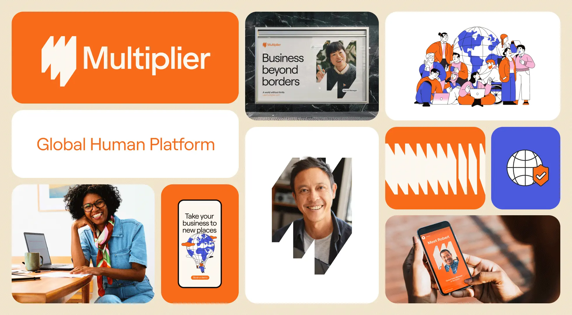
Multiplier got a big makeover. I’m really proud to introduce our new global identity to the world – a fresh, clean, more vibrant (and a whole lot more orange) expression of who we are that strategically supports change in Multiplier’s positioning while setting the stage for future growth.
Rebranding a fast-growing company is always a significant challenge, especially with a fully distributed in-house team. Balancing this process alongside ongoing brand and product marketing work is no small task. Transparency is a key value for us, and I know many CMOs, executives, and companies in general find the in-house rebranding process intimidating. I hope this article provides valuable insights.
The context to our rebranding
Multiplier was founded in 2020 and has experienced rapid growth and evolution since then. Speed is crucial for us, whether delivering new features and products, providing swift client support, or quickly onboarding, managing, and paying employees. However, this fast pace can lead to design inconsistencies and design debt.
When I joined Multiplier, the design debt was evident, which is a common issue for a young, fast-growing company. It was clear that we needed to reestablish our visual and verbal identity to support our growth and reflect our core values.
It was the perfect time to redefine ourselves for the future.
The work before the work
When I joined Multiplier, I wanted to merge my expertise in advertising, digital design, and branding, building an in-house team of multidisciplinary experts and trusted external partners aiming to centralize all brand and creative needs. Our main goals were to drive positive change, enhance awareness, and increase loyalty. And, first of all, build an iconic brand.
Thanks to many years in advertising, whenever I approach new work, I always need to get to know everything. About the context, values, competition, audience, opportunities, company culture, and what we stand for. I soon got up to speed and understood that the executive team had mixed feelings about scope, budget, and deliverables, so there was a bit of education to be done on the creative process and the effort required.
Despite challenges, there were clear positives: our product’s innovation, speed, and effectiveness, and a strong understanding of our customers and markets. Among the great core values that resonate with me are: respect for the human being, gratitude, trust, thoroughness, transparency, and community. And last but not least, the founders’ commitment to putting people at the core of what Multiplier does. This commitment was genuine and constant.
Defining our purpose: The Multiplier Way
Before diving into design, we needed a solid brand strategy. This included defining our purpose, mission, positioning, values, and brand narrative. Rushing through this step would have necessitated reworking later on.
During workshops and interviews with our executive team, one inspiring, multi-part concept stood out: the idea of eliminating geographic barriers. The idea of connecting business to people and people to the world. The idea of building “a world without limits”.

This concept became our guiding light, shaping our brand foundation and ensuring that our purpose, mission, values, personality, positioning, and voice identity were clear and aligned across the company.
Building the look and feel
When we think of a brand, we often reduce it to a logo, color, or tagline. But that’s a misunderstanding. In order to build a unique brand you need to consider a multitude of elements. You need to consider a brand system. Building a brand system isn’t a one-time task; it’s an ongoing process of development and refinement. A brand system is a living, breathing entity that evolves with the brand.
Creating such a system takes time, effort, and expertise, and it requires a phased approach. However, this effort is crucial for building a strong, consistent, and recognizable brand. It ensures that all communications, from our website to our marketing materials, are on-brand and aligned with our values and mission.
Logo
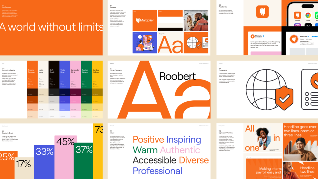
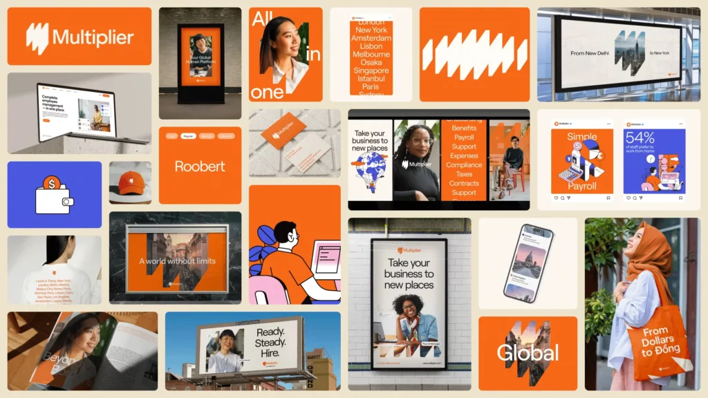
We wanted an iconic symbol to visually represent our purpose. Our symbol, called the “portal”, brings to life Multiplier’s mission. The portal symbolizes endless opportunities accessible through our platform, highlighting that these opportunities are available to everyone. It also represents the “M” of Multiplier.
The portal is a doorway to a world of possibilities, enabling instant connections with businesses and people worldwide. It’s more than a visual element; it represents our core values and mission. We’re excited to see how it will evolve and grow with our brand execution.
![]()
![]()
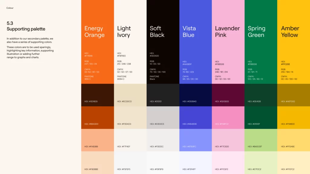
Colors
The previous brand heavily relied on blue, a common trend among tech brands, which resulted in a lack of differentiation. We needed to explore a broader palette.

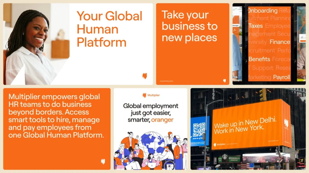
To build a strong, memorable brand, we aimed to establish and own a key color that embodies our core values. We wanted a color that signifies speed and energy, reflecting how fast we generate contracts, set up entities, onboard, and pay teams. This led us to our new primary color, “Energy Orange”, symbolizing excitement, warmth, positivity, and vibrancy.
We complemented our lead brand color with a secondary palette of four other “energetic” colors, adding variety and freshness that harmonize perfectly with our primary “Energy Orange.”
Typography
Typography is like the personality of our brand – it’s how we speak visually. And it has to work everywhere, whether it’s on a digital screen or a billboard.
We wanted our font to be modern without following current trends, because it is how you build a timeless brand. We wanted to reflect our values at Multiplier: trustworthiness, warmth and familiarity.
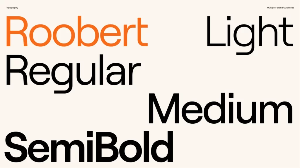
Our new font, Roobert, crafted by Displaay Type Foundry, perfectly expresses these principles. It’s accessible, works across multiple languages, and serves as a “Global Typeface”, ideal for our international presence.
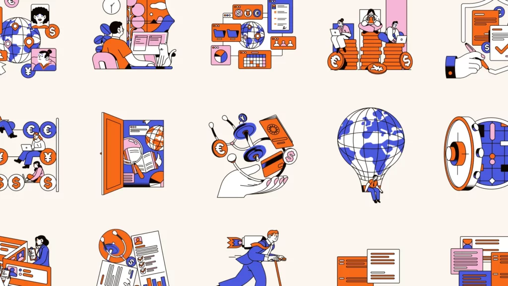
Illustration
We are a global and accessible brand, and our illustrations perfectly reflect this.

Inspired by the world of work and global teams, our illustration style simplifies the complex HR world with simple expressionism. We use our main brand colors, linear strokes for contrast, and soft, rounded shapes for a balance of simplicity and spontaneity.
Our illustrations fit seamlessly into designs and serve two purposes: top-level brand messaging and specific themes. Hero illustrations create imaginative worlds for brand stories, while spot illustrations communicate specific topics and features.
We’ve built an illustration system to communicate our values, features, and products effectively.
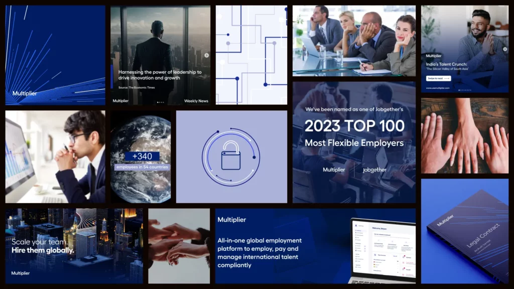
Photography
We put people at the core of what we do. In fact, we define ourselves as a Global Human Platform. This informed our approach to photography, ensuring our images authentically represent the Multiplier brand.
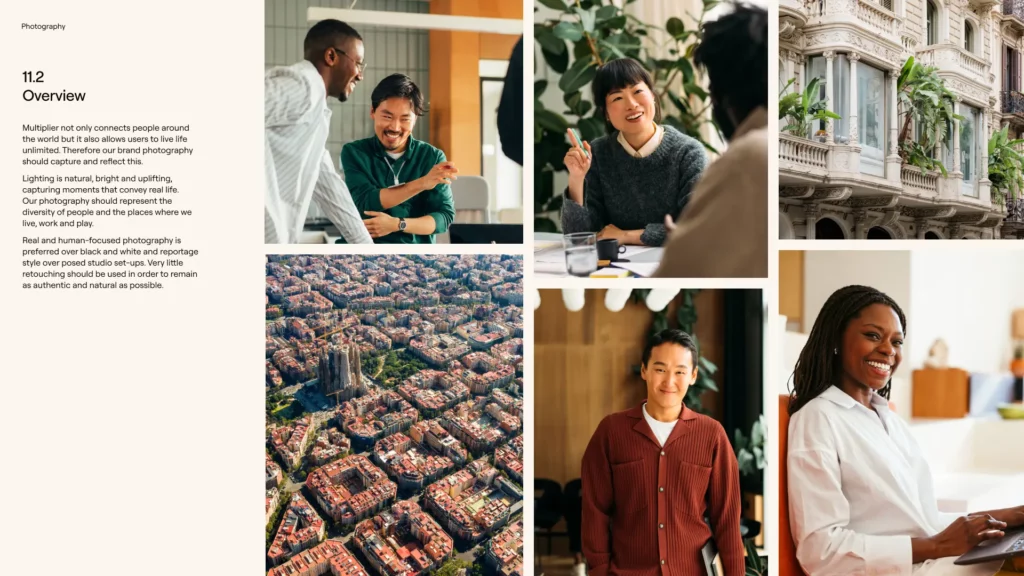
We aim to capture genuine moments, steering clear of clichés and embracing real experiences with real people — the kind you’d love to work with. We favor candid, human-focused shots over posed setups, conveying the benefits and engagement Multiplier brings. Our lighting is natural, bright, and uplifting, capturing life’s genuine moments. Diversity is key, reflecting the myriad of places and faces within our community.
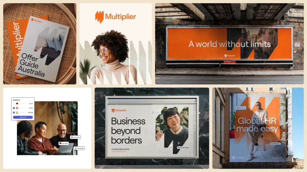
Brand and motion expression
Brand systems are not isolated elements; they must coexist harmoniously, blending to form a solid brand expression that is both consistent and flexible.
When I approach these types of work, I like to start by exploring concepts. It’s pretty straightforward: I prefer strategically connecting elements rather than creating visuals just for the sake of it.
Now, think about Multiplier. We’re all about connecting businesses and people globally. Speed is our thing (for example, we guarantee seamless onboarding in just five minutes), and we’re all about helping our customers grow limitlessly, breaking barriers and making global expansion a breeze. These three principles guide our brand expressions.
At the core of our brand expressions lies flexibility and purpose, embodied by our portal symbol. We’ve infused adaptability into our system, expanding the reach of core components. Everything stems from the portal shape, reflecting our commitment to dynamic evolution.
Motion plays a crucial role in modern branding. We incorporate motion across various assets, always mindful of our principles. Animated illustrations and pictograms to enhance the website experience. Subtle animations and micro-interactions to provide valuable feedback. Animated UI elements to highlight product features and interactions.
Design system
I’ve been around the block enough times to know that brand guidelines often look great but fall apart when applied digitally. Luckily, my background in product and digital design gives me a solid foundation to bridge the gap between marketing and product requirements. My goal was to seamlessly merge these two worlds, a task made easier by our digital-first brand approach.
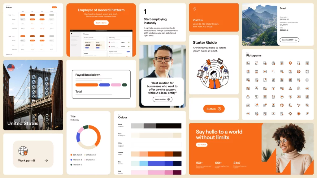
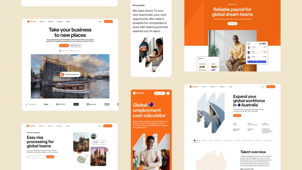
The role of branding on a website serves a very different purpose. A website needs to be informative, intuitive, and easy to navigate. Everything has to be consistent and usable. Is it user-friendly? Can people easily find what they are looking for?
We tweaked our guidelines and built a comprehensive design system that aligns closely with our product principles. Our new design system serves as our ultimate guide, minimizing design inconsistencies and streamlining the design process. It empowers us to support business growth, building and scaling better products faster, by making design reusable.
And the best part? We’re sharing our design foundation and flexible components with our Product Design team, making the Multiplier experience seamless and smooth for our users.
Feedback and roll-out
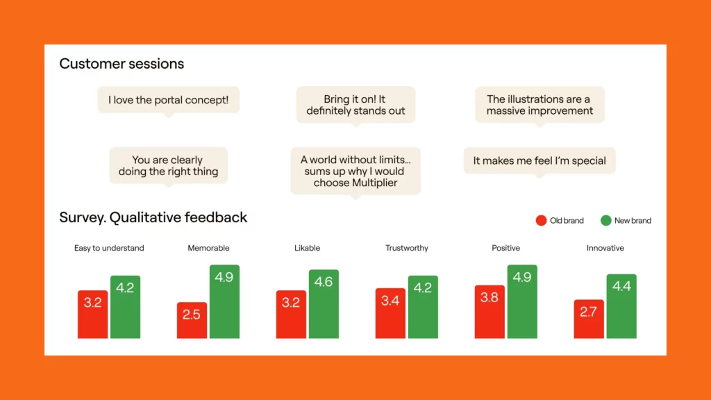
Ensuring our brand resonated with customers was really important to us. We engaged with founders, executives, and customers across various regions, conducting focus groups, A/B tests, and surveys to gather insights. The results were overwhelmingly positive.
After that, we began rolling out the design across our assets and channels (this process could fill an entire article, if not a book, so I will keep it for another day).
Was all of this easy? Definitely not. It involved building a fully-remote team, constantly re-evaluating and reprioritizing, establishing and refining workflows, and coordinating with all departments. But I’m really proud of how far we’ve come.
We’ve achieved a consistent, recognizable, and bold brand identity that works across all materials and channels. However, there’s still more work ahead.
The future: What’s next?
This isn’t the end—it’s the beginning. We’re committed to ongoing improvement and refinement. That means not only expanding our brand direction to include new products, website pages, collaterals, but also refining our overall brand strategy.
As much as we love the creative process, documentation is equally important. We’ve made significant progress in crafting and documenting a shared Design System between Product and Brand. This will have a monumental impact on how we collaborate and work together, covering everything from motion guidelines to sound design. We’ll keep refining and iterating on this to ensure our brand stays consistent and polished.
While our brand journey continues, the Multiplier brand is now live!
Get in touch if you want to learn more about Creative, Brand, and Design at Multiplier. Looking for Creative/Brand/Design roles? Check out our careers page.
Big thanks to Aashna, Adam, Adina, Akshar, Amrit, Anchal, Binita, Chris, Daniel, Davide, Drew, Elliot, Emma, Emily, Giorgia, Johnson, Lewis, Liz, Monish, Nemanja, Nick, Pirai, Ranjani, Ria, Sagar, Sam, Stefano, Steve, Supriya, Usama, Valerie, Vamsi, Victoria, Vina, Vingesh, and the whole Multiplier team.